Sunday, April 3, 2011
Impossible Color
The Impossible Project held true to their commitment to bring a stable color film reminiscent of classic Polaroid 600 film. Coming soon to the line up, PX680 Color Shade. Better temperature range and more light safe. The secret film testers announced and posted their images via Flickr (this is the main PX680 group) and blogs. Lots of samples of beautiful, rich and colorful images. With this announcement came an opportunity for Impossible Pioneer card holders to purchase some of the beta 2 version of the film, of which I ordered two packs (knew I should have made it three). I believe the First Flush edition of this film will be out by early May (maybe sooner) with a Spectra version out in early Summer.
I have only shot through one pack of film so far. My first three shots were duds though. I use a ND filter over the lens of my SX-70 Sonar and what I discovered was that I think this film isn't quite as fast as 600 (or at least in beta form). I normally have to dial the exposure wheel all the way to dark, but when I did that the shots came out very underexposed. If I had been a little patient and waited to see the results I could have corrected instead of firing off another in excitement, oh well. Then at some point I took another, but forgot I had removed the ND filter and so it was way overexposed. Definitely some minor grumbling going on at first. However, what I did learn is that there is some room to play with the exposure which is a good thing to know now.
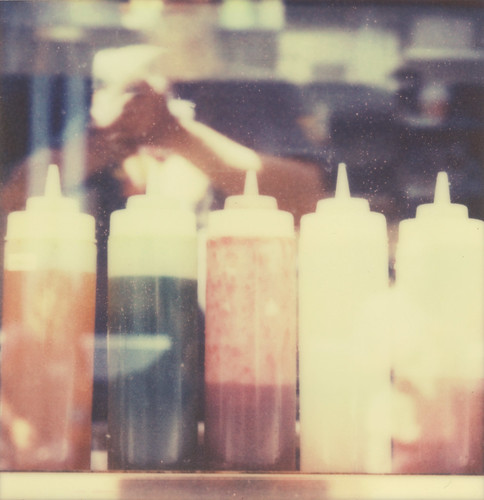
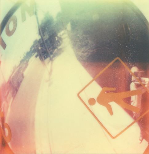
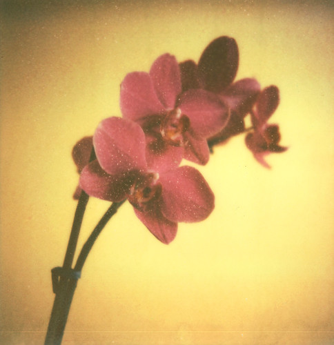
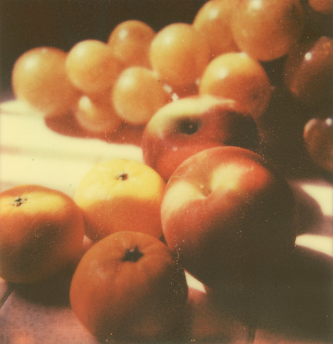
Once I quit screwing around and took some shots with good light I was pretty happy with the results. Has a little bit of a learning curve to it, but if you're good with the other flavors then this should be similar to get used to, if not easier. Other then giving it a brief cover on eject for the first 7-10 secs, the film holds up really well in shaded areas and indoors, so need to cover. Bright sun, then its advised to cover. Also gives you some creative control to flash the film as well. There is a definite warmth, almost golden quality to this film and fair amount of texture, detailed but still rough. Yellow creamy whites and more intensity in color, but muted just enough that it feels vintage still. The beta batch has some white speckles in the image area that is the result of the hand mixing process for the test film. The First Flush edition should remove most of that according to Impossible.
Pretty happy and amazed with the quality of the film. If its looking and behaving this well already, then the next editions will be fantastic. I'm looking forward to the next batch and just in time for Summer. Congrats to the Impossible team for making it happen.
Subscribe to:
Post Comments (Atom)


i would say april... nice photographs!
ReplyDelete